Benches, Not Billboards: Why Your Website Should Feel Like a Place, Not an Ad
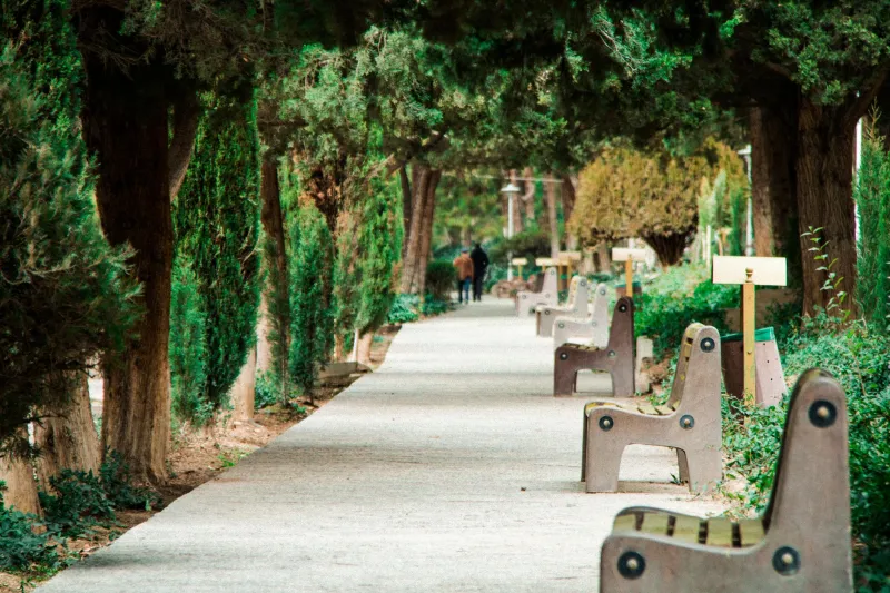
Ask most small business owners what their website is for, and you'll usually get some version of "it's where people find my info." Fair enough. But that framing quietly turns your site into a billboard — something people drive past, glance at, and forget by the next exit.
We'd like to propose a different metaphor, and yes, it's baked into our name. Your website isn't a billboard. It's a park.
Think about what makes a good park work. People don't just pass through it — they linger. There are benches, paths, shade, something new to notice each season. Nobody puts up a billboard in a park and calls it landscaping. And nobody visits a park twice if the gates are locked or the trails dead-end into a fence.
Dwell Time Is Your Foot Traffic
Parks measure success by how long people stay. Websites should too. If analytics show visitors bouncing in eight seconds, that's not a traffic problem — it's a hospitality problem.
What makes people linger online? The same things that make them linger on a bench: something worth reading, a clear place to rest their eyes, and the sense that there's more around the next corner. A helpful FAQ page, an honest "About Us" story, a photo gallery that actually shows your work — these are the benches of the web. They cost little and keep people around long enough to trust you.
Lay Paths, Not Mazes
Every decent park has worn dirt trails showing where people actually want to walk. Your website has the same thing, and your analytics are the worn grass.
Look at where visitors actually go. If everyone's hunting for your phone number, put it where it's obvious — not buried in a footer like a restroom at the far end of the grounds. Navigation should feel like a well-marked path: you always know where you are, and there's always a clear route to what you came for.
A few path-checking questions:
- Can a first-time visitor tell what you do within five seconds of landing?
- Is the contact page reachable in one click from anywhere?
- Do your menu labels use your customers' words, or your industry's jargon?
If the answer to any of those is no, you've built a maze, not a trail system.
Seasonal Refreshes Beat Annual Overhauls
No city waits five years to replant a park's flower beds. Parks are maintained continuously in small doses — a new bench here, mulch there, the broken swing fixed before someone complains.
Websites thrive on the same rhythm. Swap in fresh photos each season. Update your hours before the holidays, not after a customer shows up to a locked door. Retire the 2019 blog post advertising an event that's long past. These small touches signal that someone's still tending the place — and both human visitors and Google's crawlers notice.
The alternative is the sad park: peeling paint, dead grass, a fountain that hasn't run since the pandemic. Nothing is technically broken, but everything whispers "nobody's home."
What This Means for Conversions
Here's the practical payoff. Billboard thinking optimizes for the glance: big headline, one button, hope for the click. Park thinking optimizes for the relationship. A visitor who reads two pages, watches a thirty-second video, and bookmarks your pricing guide is dramatically more likely to become a customer than one who bounced off a landing page in a hurry.
Slower, yes. But like a park, a well-tended website compounds. Regulars bring friends. Search engines reward the fresh content and steady engagement. Your site becomes an asset people return to instead of an ad they scroll past.
So walk your own site this week like a first-time visitor on a Saturday morning. Where would you sit? Where's the path overgrown? Where would you turn around and leave? Fix one of those things. Then come back next month and fix another.
That's how you run a park. Turns out it's how you run a website, too.