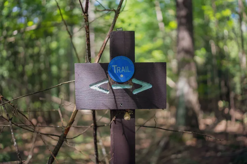
Five Seconds to Make the Case: The Trailhead Sign Test for Your Homepage
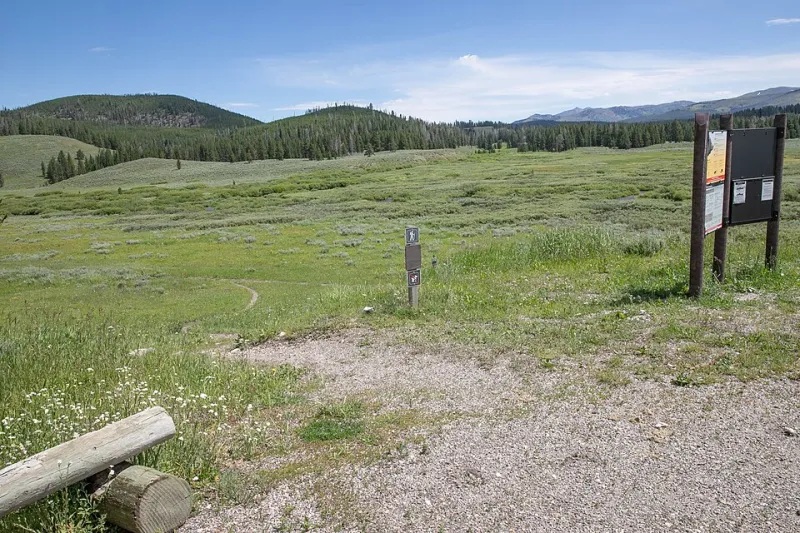
Photo: NPS/Diane Renkin, Public domain, via Wikimedia Commons
Every decent trail in America has a sign at the start. It tells you where you are, how long the hike is, what the difficulty is, and which way to the waterfall. You don't have to study it — you glance, you get it, you go.
Your homepage has to do the same job. Visitors don't read websites; they skim them the way hikers skim trail signs. If they can't figure out the essentials in about five seconds, they turn around and head back to the search results.
So here's a quick audit you can run today. Pull up your homepage, set a timer for five seconds, then look away and answer five questions from memory.
The Five Questions
1. Who is this? Your business name and what you actually do should be unmistakable — not clever, not mysterious. "Baxter & Co." means nothing. "Baxter & Co. Plumbing, Serving Tucson since 1998" means everything.
2. What do they offer? Visitors should be able to name your core product or service. If your headline is a slogan like "Built for Tomorrow," you've wasted your best real estate on a riddle.
3. Who is it for? A homeowner with a burst pipe and a commercial property manager are different customers. Say who you serve — "residential HVAC for the Denver metro area" filters and reassures at the same time.
4. What does it cost (or how do I find out)? Not every business can list prices, but you can offer something concrete: "Free estimates," "Starting at $49/month," "Book a 15-minute consultation." Vagueness about money makes people leave.
5. What do I do next? There should be one obvious action — a button, a phone number, a booking link. Not six competing calls to action. One clear next step beats a menu of hesitation.
Passing and Failing in the Wild
Fails the test: A full-screen photo of a sunset with the words "Inspiring Excellence Since 2009" and a hamburger menu. Pretty? Sure. Informative? Not in five seconds.
Passes the test: "Family Dentistry in Boise, ID — New patients welcome. Same-week appointments. Call (208) 555-0142 or book online." That's who, what, who for, and next step, all in one glance. Cost question is answered with "most insurance accepted" a scroll down.
The difference isn't budget or design talent. It's deciding that clarity beats cleverness.
Run the Audit Yourself
Grab a friend who's never seen your site. Show them the homepage for five seconds, then ask the five questions. If they miss two or more, you've found your weekend project.
The usual fixes are simple:
- Replace your tagline headline with a plain statement of what you do and where you do it.
- Move your phone number and primary button above the fold — top right corner is the classic spot for a reason.
- Trim the navigation. If a trail sign listed thirty destinations, it wouldn't help anyone.
- Add one concrete pricing or estimate cue so money isn't a mystery.
Maintenance, Not Redecoration
This is the kind of upkeep we're always nudging folks about: small, regular checkups beat the big rebuild. Your homepage is the trailhead sign for your whole business, and signs wear out. Staff change, services shift, phone numbers get ported. Put "five-second homepage audit" on your calendar once a quarter — right next to checking your backups and renewals.
Five questions, five seconds. If your visitors can answer them, they'll take the next step. If they can't, no amount of beautiful scenery will keep them on the trail.