Where's the Ranger Desk? Making Your Website a Place People Want to Stop At

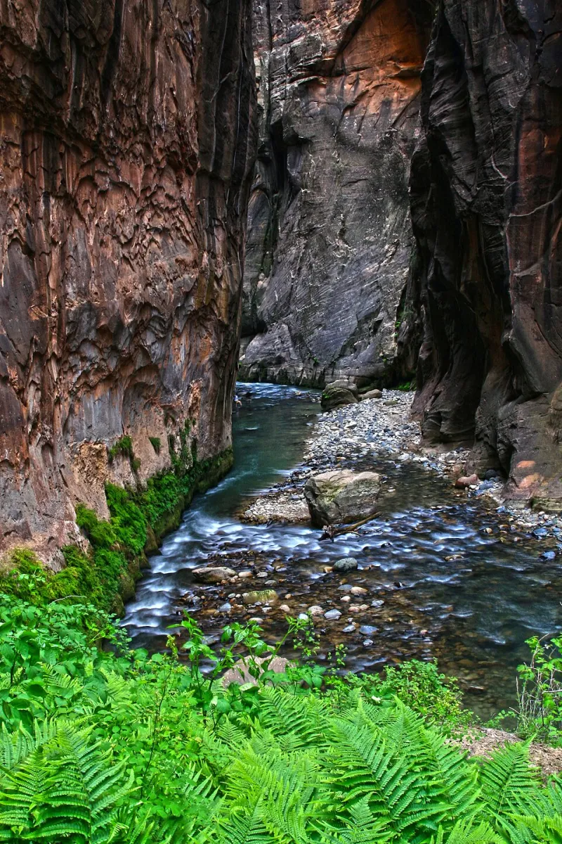
Photo: Dietmar Rabich, CC BY-SA 4.0, via Wikimedia Commons
Walk into the visitor center at just about any national park and you'll notice something right away: nobody's trying to sell you anything. A ranger looks up, says hello, and asks the question every newcomer is quietly thinking — what are you hoping to do today? From there you get a map, a couple of honest tips, maybe a warning about the trail that's washed out. Ten minutes later, you leave feeling oriented. Capable. Welcome.
Now think about the last time you landed on a small business website. Too often the experience is the opposite of a visitor center. There's no greeting, no map, no one to ask. Just a form to fill out, a button to click, a checkout to push through. The site isn't welcoming you — it's processing you.
I'd argue that's a fixable problem, and one that belongs on your website maintenance list right next to software updates and broken-link checks.
The Terminal Problem
Plenty of small business sites get built with one goal: reduce friction. And sure, friction is bad when someone already knows what they want. But most first-time visitors aren't ready to transact. They're lost. They have questions they can't articulate yet, and they're deciding in about thirty seconds whether you're the kind of outfit they trust.
A transaction-only website treats those people as failed conversions. A welcoming website treats them as guests who haven't been helped yet.
Build Yourself a Ranger Station
You don't need a redesign or a budget line item. You need a handful of touches that say we expected you, and we're glad you came.
A FAQ written like a person, not a lawyer. Most FAQs are defensive — refund policies, shipping windows, liability boilerplate. A ranger-style FAQ answers the questions people actually hesitate to ask: "Do I need experience for this?" "What if I show up and hate it?" "Who exactly am I going to be dealing with?" If your FAQ reads like it was written to protect you, it isn't helping anyone.
Real photos of real people. Stock imagery is the website equivalent of a cardboard cutout at the front desk. A photo of your actual shop on a Tuesday afternoon, your crew mid-job, the dog that greets customers — these cost nothing and do more for trust than any testimonial widget.
Directions to help, not just to purchase. A ranger hands you a map. Your equivalent: a plainly written "Start Here" or "How This Works" page that walks a newcomer through what working with you looks like, step by step. It's the single most under-built page on small business sites.
An honest voice in the copy. Rangers will tell you the trail is muddy and the parking lot fills up by nine. Admitting a limitation — "we're a two-person shop, so big rush jobs aren't our thing" — paradoxically makes you more credible, not less.
Maintenance Is Hospitality
Here's the tie-in that matters: a welcoming website isn't a one-time project. It's upkeep. FAQs go stale. "About Us" pages keep photos of employees who left two years ago. Hours change after a holiday weekend and nobody updates the homepage.
Put a recurring item on your maintenance calendar — quarterly works for most small businesses — and walk your site the way a ranger walks the grounds: Is the signage accurate? Is the map current? Would a first-timer feel oriented in under a minute?
The Payoff
People remember how a place made them feel. The visitor center doesn't close the sale of a national park vacation — it just makes you glad you came, which is why you come back. Your website works the same way. The visitor who leaves today with a question answered, even without buying, is the one who returns next month with a credit card and a name they already trust.
Set out the map. Staff the desk. Welcome people before you process them.